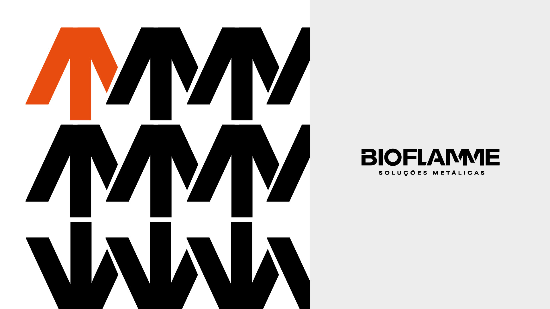
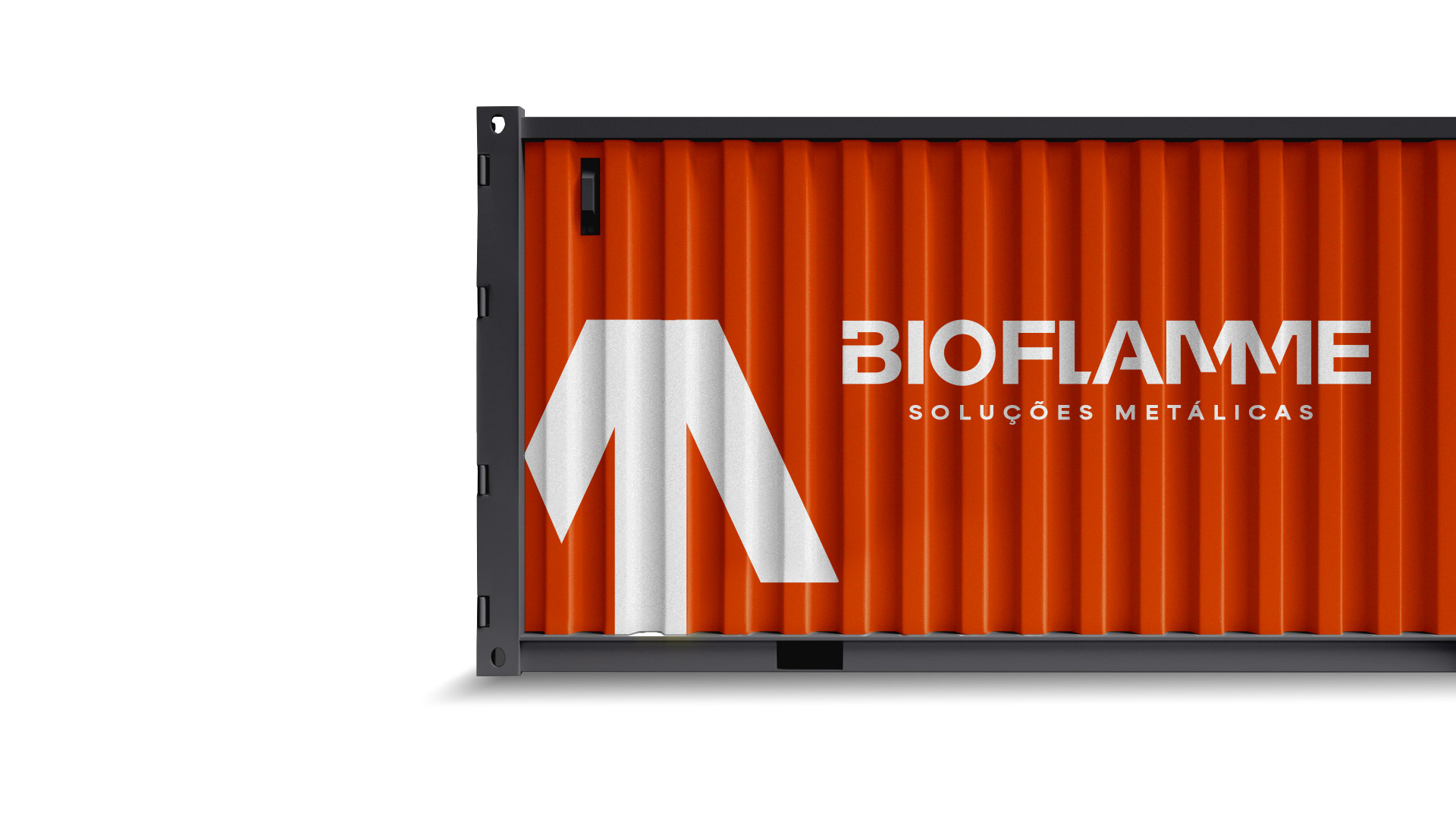
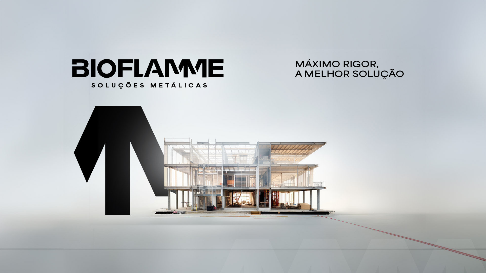
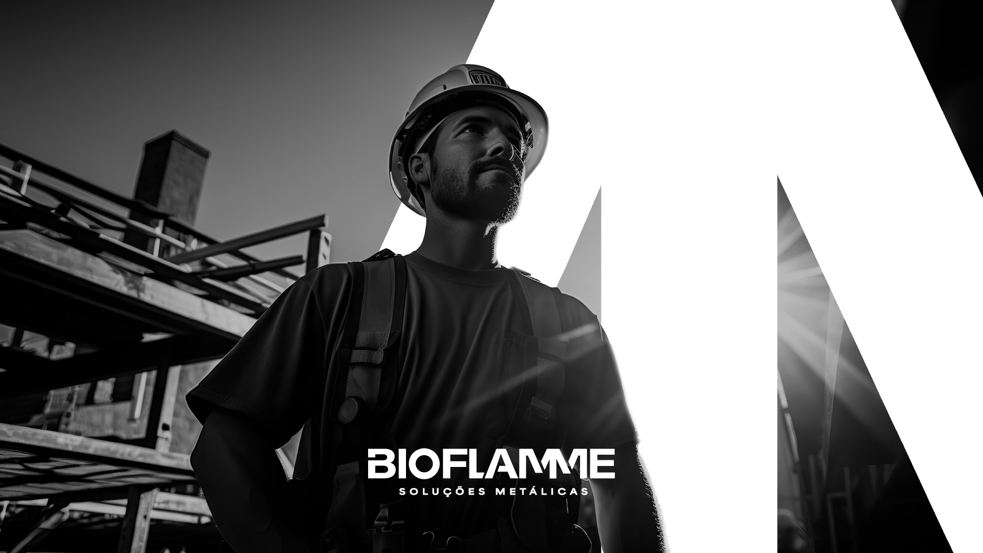
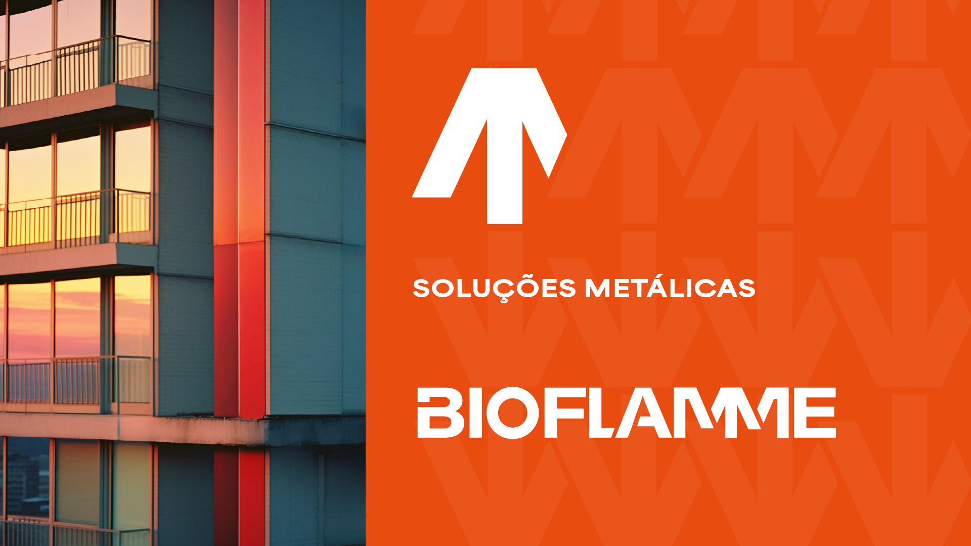
Bioflamme's identity reflects the industrial, bold character of the brand and the sector in which it operates. The lettering conveys a cohesive structure, where the precise fit of the letters forms a solid and striking block. The diagonal cuts create a symbol that sums up the essence of elevation and growth, representing the evolution of the brand, its projects and solutions.
A modular layout with navigation orientated towards an interactive experience fully aligned with the client's expressed desire - "a website that functions as a working tool for various departments of an organization". This desire defined our approach, which is evident in the technical nature of the content and the filters designed to quickly reach the best solutions. Visit www.exporlux.pt for direct contact with the project.
At euroamenos.pt, you'll find "Big brands at small prices." This online store features a wide portfolio of food products and consumer goods. This is a case of respect for the client's communication and positioning, where the project's identity colors have transitioned into the digital world. With a focus on the experience of quick and easy purchasing, the store offers various payment methods.